
El Museo del Prado
Redesigning a world-class museum’s digital experience to feel as timeless as its collection.
Overview
El Museo del Prado is a self-serving kiosk designed for one of the world’s most prestigious art museums. The project was developed as part of an Interaction Design course at Northern Illinois University, with the goal of creating a digital experience that allows visitors to accomplish their goals efficiently — without confusion or distraction.
The challenge
The kiosk needed to serve a wide range of museum visitors — from first-time tourists buying tickets to returning guests browsing exhibits and accessing artist information. The core design challenge was balancing the museum’s rich visual identity with a clean, intuitive interface that anyone could pick up and use from the moment they touched the screen

The outcome
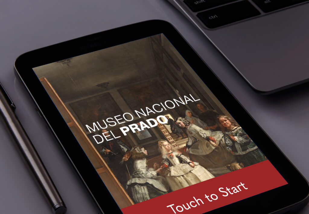
A polished, user-centered kiosk interface that guides visitors seamlessly through the museum experience — from the opening “Touch to Start” screen through browsing, ticketing, and exhibit discovery — all grounded in the visual language of one of the world’s greatest art institutions.
My Approach
How do you bring a 500-year-old collection into the digital age without losing its soul?
The design process began with the fundamentals: who is using this, what do they need, and what should they see first? From there a Site Map, User Flow, and Journey Map were developed to plan the full navigation architecture — mapping every path a visitor might take, with ticket purchasing identified as the highest-priority interaction.
Low-fidelity wireframes were created in Figma to explore the layout and structure before committing to visual decisions. These were then evolved into high-fidelity wireframes that incorporated the Prado’s branding — its colors, typography, and logo — to create a cohesive experience that felt like a natural extension of the museum itself.

© 2024 ·