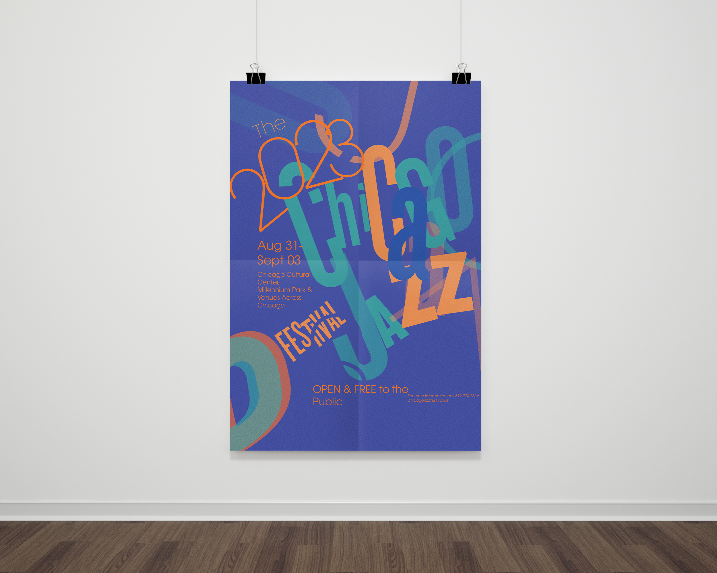
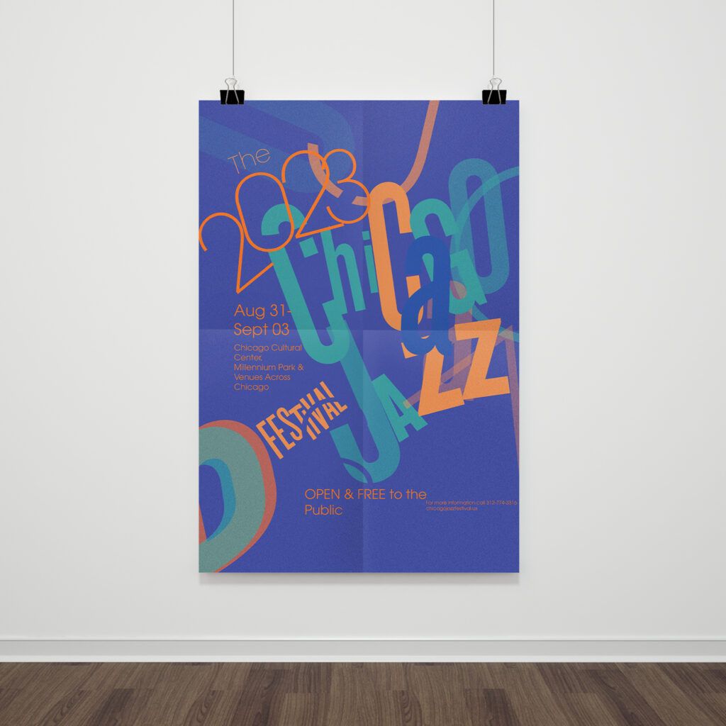
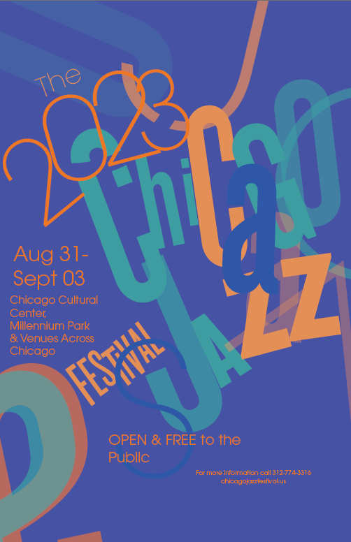
2023 Chicago Jazz Poster
Redesigning a world-class museum’s digital experience to feel as timeless as its collection.
Overview
Design a poster and brochure for the Chicago Jazz Festival 2023, inspired by the vibrant world of Big Band jazz. The design should capture the energy, sophistication, and nostalgia associated with this iconic musical era.
The challenge
Jazz is one of the most expressive and improvisational art forms in American music history — but translating that energy into a static printed poster is no small task. The challenge was to design a festival poster and brochure for the 2023 Chicago Jazz Festival that could communicate the dynamism, rhythm, and cultural richness of Big Band Jazz at a single glance.
The design needed to feel immediately alive. It had to honor the legacy of the genre’s icons — Glenn Miller, Frank Sinatra, Ella Fitzgerald, Benny Goodman, Tommy Dorsey — while speaking to a contemporary Chicago audience. And it had to do all of that with nothing but type, color, and composition.
The outcome
The final poster is a visually striking piece that communicates the festival’s energy before a single word is read. The expressive typographic treatment makes the design feel kinetic and alive — exactly the quality Big Band Jazz demands from any visual representation.
The blue and orange palette creates immediate visual impact at a distance, which is critical for printed street-level poster design. Up close the layered typography rewards attention, revealing the festival details — dates, location, and the open-and-free-to-the-public message — woven naturally into the composition.
The project demonstrated that editorial design at its best doesn’t just inform — it performs. This poster doesn’t describe the Chicago Jazz Festival. It sounds like it.
My Approach
The process started on paper. Before opening any software I sketched out the concept — working through how the typography should move, where the hierarchy should land, and what the viewer’s eye should do when it hits the page. The core idea was simple: the type itself should feel like music. Letters overlapping, scaling, and colliding the way instruments do in a jazz ensemble.
From there the design moved into execution. A blue and orange color palette was chosen deliberately — high contrast, energetic, and rooted in the bold graphic language of vintage American poster design. Blue as the stage, orange as the spotlight. The typography was treated not as information but as rhythm — each letterform a beat, each line a measure.
The composition pulls from the improvisational spirit of the music itself. Nothing feels rigidly grid-based. The layout breathes and moves, with elements pushing against each other the way jazz musicians push against the beat — always in conversation, never mechanical.
© 2024 ·