Tequila El Pavo Real
Where the majestic peacock meets the spirit of Mexican tequila.
Overview
Tequila El Pavo Real is a logo design and brand identity concept developed for an ARTD 201 class project. The brief was to design a logo for a chosen industry — and from the very start the vision was clear: a tequila brand that felt legacy, regal, majestic, traditional, smooth, bold, family-oriented, and full of pride and quality.
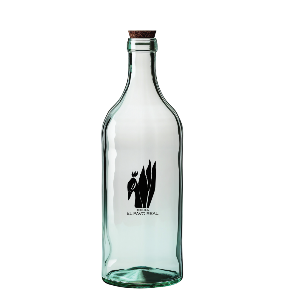
The project went through three distinct logo iterations before landing on a final mark that embodied every one of those brand adjectives. What began as a rough marker sketch of a peacock became a striking, elegant silhouette — one that works as beautifully on a tequila bottle label as it does reduced to a 1:1 square.
Behind the name
El Pavo Real is Spanish for peacock. The name was chosen for its cultural resonance, its elegance, and the way it immediately positions the brand in the premium tier without saying a single word about price. Peacocks are associated with royalty, pride, and beauty across cultures — qualities that translate directly into the identity of a family-heritage tequila brand.
The peacock also carries a visual richness that made it perfect for logo exploration — intricate feathers, a proud silhouette, and a natural authority that commanded the page from the first sketch.
The challenge
Designing a logo for the tequila industry means entering a crowded visual space. Premium tequila brands compete heavily on identity — every detail from the mark to the label to the bottle shape carries meaning. The challenge was to create something that felt immediately premium and rooted in Mexican heritage, while also being clean enough to work across every application from bottle to billboard.
The deeper design challenge came during the iteration process. Several important questions had to be answered before the mark could be finalized: How many agave leaves are enough to clearly represent the tequila industry without overcrowding the composition? Do the peacock’s head feathers carry any symbolic significance and how do they relate visually to the agave leaves? How do all the elements balance each other without any single element dominating or getting lost?
These questions drove every round of refinement.
The outcome
The final Tequila El Pavo Real logo is a bold, elegant silhouette that communicates everything the brand stands for before a single word is read. The peacock and agave composition is immediately recognizable, scales cleanly from bottle label to 1:1 favicon, and carries the full weight of the brand adjectives — legacy, regal, majestic, traditional, smooth, bold, family-oriented, pride, quality, and industry.
The logo iteration process shown in the portfolio — from rough marker sketch through three distinct versions to the final mark — demonstrates a rigorous design thinking process. Not just aesthetic decision-making, but strategic refinement guided by clear brand criteria at every step.
The full brand system including the bottle label mockup and the Paloma print advertisement shows how a single well-conceived logo can anchor an entire visual world — from the product in your hand to the ad on the page.
My Approach
The process started with marker sketches — loose, exploratory, searching for the right angle and composition. Early sketches explored the peacock from multiple viewpoints before one perspective emerged as undeniably right: a side angle with the eye fixed directly toward the viewer.
This angle was chosen deliberately. A peacock looking straight at you conveys strength, confidence, and presence — qualities that align perfectly with the brand adjectives. There is nothing tentative about a peacock making eye contact. It commands attention.
Three complete iterations followed. Each one refined the relationship between the peacock silhouette and the agave leaves rising behind it — the leaves serving as both a visual backdrop and a clear signal of the tequila industry. The balance between the two elements was the central design tension throughout: enough agave to communicate the product, enough peacock to carry the brand character, and enough negative space to let the mark breathe.
The final iteration was described as a happy accident — the moment when everything aligned. The peacock’s posture, the arrangement of the agave leaves, the weight of the silhouette, and the placement of the wordmark Tequila El Pavo Real all came together in a composition that felt inevitable rather than constructed.
The brand system extended beyond the logo into a full print advertisement featuring Paloma — a campaign concept built around the classic Paloma tequila cocktail. The ad copy reads: “More than a girl’s name.” Positioned as an aristocrat exuding warmth and charm rather than aloofness, the Paloma campaign gives the brand a voice to match its visual identity — elegant, confident, and inviting.
© 2024 ·
JFernandezStudio
© 2024 ·