
American Foundation for Suicide Prevention
Redesigning a symbol of hope to feel more human, more warm, and more alive.

Overview
The American Foundation for Suicide Prevention (AFSP) is one of the most important mental health organizations in the United States — dedicated to offering mutual support, raising awareness, and preventing suicide through volunteer efforts and community connection. For a graphic communication class project, the brief was to redesign AFSP’s logo with a fresh visual concept that stayed true to the organization’s mission while bringing new warmth and human presence to the mark.
The original AFSP logo features a lifesaver symbol — functional and recognizable, but visually distant. The redesign asked a different question: what if the logo showed people actually reaching for each other?
The challenge
A logo for a suicide prevention organization carries enormous responsibility. It has to communicate hope without feeling hollow. It has to be warm without being naive. It has to instantly signal safety, connection, and the act of showing up for someone — without being heavy-handed or clinical.
The existing lifesaver mark communicated rescue from a distance. But AFSP’s work is fundamentally about human contact — recognizing the signs, reaching out, being present. The challenge was to redesign the logo so that it communicated that intimacy and connection at a glance, while remaining clean enough to work across all touchpoints from business cards to billboards.
The outcome
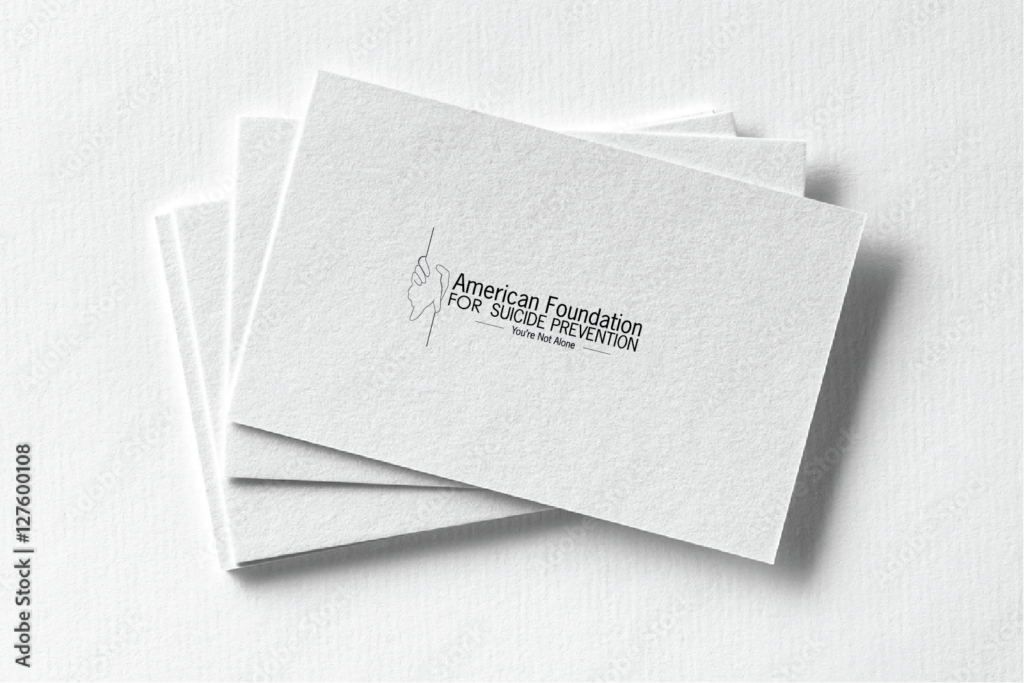
The redesigned AFSP logo achieves what the original mark didn’t — it puts people first. The grasping hands communicate compassion, presence, and the human touch that is at the heart of everything AFSP does. Where the lifesaver symbol suggested rescue from afar, the hands suggest someone already there beside you.
The teal and purple palette reinforces the organization’s identity within the awareness movement while giving the mark a visual warmth that feels approachable rather than institutional. The clean linework keeps the logo versatile — working at small sizes on business cards and scaling up without losing clarity.
This project reinforced a core belief: that the best logo design doesn’t just identify an organization. It embodies what that organization stands for — and makes you feel it before you’ve read a single word.
“The best logo design doesn’t just identify an organization — it embodies what that organization stands for, and makes you feel it before you’ve read a single word.”
My Approach
The concept centers on a single powerful image: grasping hands. Two hands reaching toward each other — one offering, one receiving. This visual speaks directly to AFSP’s core mission. The hands symbolize a lifeline, the importance of recognizing when someone needs support, and the simple but profound act of reaching out.
Unlike the original logo which places the lifesaver symbol at the center, this redesign places the human moment at the center. The hands become the focal point — warm, approachable, and immediately legible as an image of care and connection.
The color palette was chosen with intention. Teal and purple — both widely associated with suicide prevention awareness — were incorporated to reinforce the logo’s message and ensure it reads as part of the broader awareness movement. These are colors that carry meaning in this space, and using them grounds the redesign in the visual language people already associate with the cause.
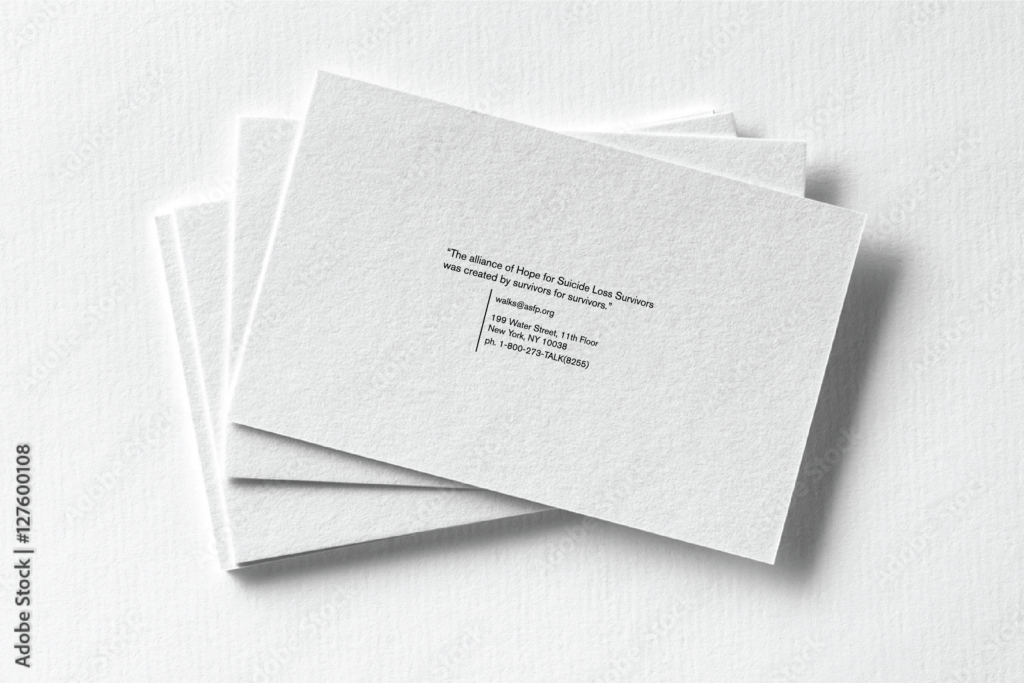
The resulting mark pairs cleanly with the AFSP wordmark in both horizontal and stacked configurations, making it flexible across business cards, digital applications, and print materials. The business card design shown in the portfolio demonstrates how the identity system extends beyond the logo itself — with the quote “The alliance of Hope for Suicide Loss Survivors was created by survivors for survivors” anchoring the back of the card with purpose and voice.
© 2026 ·