Lutris riverboat & casino
From sea otter to spade — how one animal’s nose became a casino brand.
Overview
Lutris Riverboat & Casino is a brand identity concept developed for an ARTD 212 class project. The brief was deceptively simple: choose a service or industry, choose an animal, draw it, and reduce it — again and again — until only the most essential version of that animal remained. Then take one defining feature of that animal and let it become the foundation of an entire brand.
What started as a drawing exercise became something much more interesting: a logo that works on multiple levels simultaneously, where nature and industry meet in a single minimalist mark.
Behind the name
The name Lutris comes directly from Enhydra lutris — the scientific genus name for the sea otter. It was chosen deliberately. Sea otters are known for their playful, social, and intelligent behavior, qualities that translate perfectly to the world of riverboat entertainment and casino culture. The name sounds elegant and slightly mysterious without immediately revealing its animal origin — exactly the kind of layered sophistication a casino brand needs.
The riverboat connection came naturally. Sea otters live in water. A riverboat casino lives on water. The logic was clean, and the concept locked in from there.

The challenge
The project required solving two problems at once. First, the reductive drawing challenge — taking a complex animal and stripping it down through multiple iterations until only the most recognizable and essential version remained. Second, the branding challenge — finding a feature within that simplified form that could carry the weight of an entire visual identity.
The hardest part was the reductive process itself. Every sketch had to be simpler than the last, but still recognizable. Strip too much and you lose the animal entirely. Keep too much and the mark becomes too complex to work at small sizes — and a logo that can’t scale down to a 1:1 favicon is a logo that fails in the real world.

The outcome
The Lutris logo is a study in the power of reduction. What began as a realistic animal drawing ended as a mark that is simultaneously a sea otter, a spade, and a brand — three things living in one clean shape.
The process proved a fundamental principle of logo design: the best marks don’t just look good, they think well. Every line in the final Lutris mark exists for a reason. Nothing was left by accident and nothing was removed without intention.
The name, the animal, the industry, and the icon all connect through a single design decision — a nose that looks like a spade. That’s the kind of conceptual clarity that makes a brand identity truly memorable.
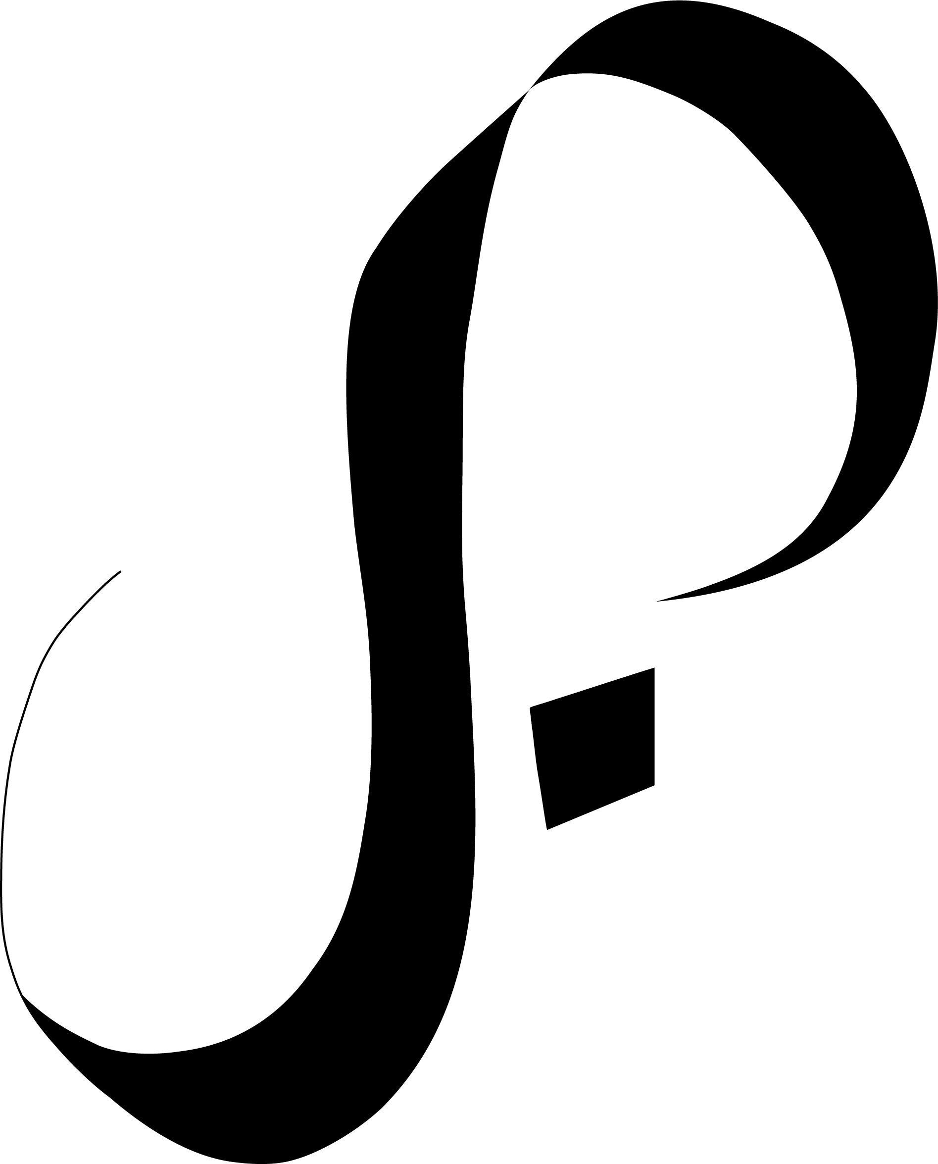
My Approach
The breakthrough came from the sea otter’s nose. Studying the animal closely, one feature stood out — the nose, with its distinctive rounded shape and central ridge, bears a striking resemblance to a spade. Not just any spade, but the kind printed on a playing card. The connection was immediate and undeniable.
From there the concept wrote itself. A casino brand built on the spade-like nose of a sea otter, reduced to its most minimal form, carrying the dual meaning of the animal and the game in a single mark.
Multiple sketch rounds followed — each one stripping away another layer of detail. The goal was to find the exact threshold where the mark still reads as a sea otter to someone who knows, but also reads as a clean, iconic casino symbol to someone who doesn’t. That tension between the two readings is what gives the logo its depth.
The final mark lands in exactly the right place — minimalist enough to work at any size, including a tiny 1:1 square, but detailed enough that once you see the sea otter in it, you can’t unsee it. The logo rewards a second look, which is exactly what the best brand marks do.
© 2024 ·