Serpenta
Where the majestic peacock meets the spirit of Mexican tequila.
Overview
Serpenta is a conceptual luxury eletric automotive brand build around the philosophy of restrained power, engineered precision, and symbolic motion. Rather than following the traditional language of aggressive performance vehicles or overly futuristic electric brands, Serpenta was designed to feel architectural, intelligent, and timeless. At its core, the brand explores the relationship between structure and movement–where geometry, materiality, and emotion coexist in balance. Every visual decision, from the Tesellation Mark to the muted industrial color palette, was developed to communicate quiet confidence instead of spectacle. Serpenta positions itself not simply as a car manufacturer, but as a design system shaped by discipline, intention, and motion.
Behind the name
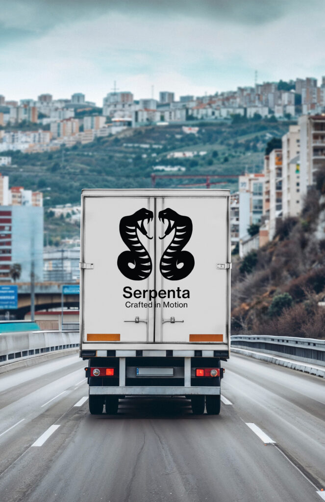
The name Serpenta originates from the symbolism of the serpent–a figure historically associated with transformation, intelligence, precision, and controlled power. Rather than referencing the serpent literally or aggressively, the brand abstracts its essence into a refined visual language built through geometry, tessellation and engineered reptition. The serpent became a metaphor for: fluid movement, adaptability, silent strength, and continuous evolution. This philosophy informed both the product design and the broader identity system. The brand’s signature asset, the Serpenta Tessellation Mark, translates these ideas into a modular triangular structure anchored by bold diamond nodes–creating a visual system that feels alive without becoming ornamental.

The challenge
The primary challenge behind Serpenta was creating an automotive identity that could feel luxurious without relying on traditional luxury cliches, futuristic without appearing trend-driven, and emotional without becoming overly expressive. Many electric vehicles brands lean heavily into one of two extremes: 1. Aggresive hyper-peformance aesthetics or sterile minimal technology branding.
Serpenta sought to occupy a different space entirely–one grounded in architectural restraint and engineered elegance. Another key challenge was developing a recognizable visual language that could extend seamlessly across digital interfaces, vehicle branding, packaging systems, environmental graphics, and future product ecosystems.
The identity needed to function both as a high-end automotive marque and as a scalable modern design system.

The outcome
The final Serpenta identity system successfully established a luxury EV brand language that feels: modern yet timeless, technical yet emotional, and minimal yet recognizable.
The Tessellation Mark became a scalable visual asset capable of functioning as a background texture, website illustration, UI background, environmental branding element, and premium print application.
The overall system communicates a brand that values structure over spectacle, intention over excess, and refinement over noise.
Rather than competing for attention through aggression or trend-driven futurism, Serpenta presents itself with quiet confidence–creating an identity that feels deliberate, intelligent, and built to endure.
My Approach
The design process began not with vehicles, but with structure.
Moodboards focused heavily on brutalist and parametric architecture, industrial materials, tessellation systems, sculptural lighting, and controlled motion studies.
Instead of drawing inspiration from automotive competitors directly, the brand borrowed visual cues from: architectural rhythm, luxury editoral design, engineered materials, and symbolic abstraction. This led to the development of the Serpenta Tessellation Mark–a geometric brand illustration system constructed from triangular lattices and intentional diamond-shaped anchors.
The color palette was intentionally restrained: deep obisidian black, industrial charcoal, muted teal, antique olive, and soft bone white. Together, these tones created a visual identity that felt: engineered, sophiscated, calm and enduring.
Typography, layouts, and imagery followed the same philosophy: quiet authority, negative space, precise alignment, and motion through composition rather than decoration.
© 2024 ·
JFernandezStudio
© 2024 ·
JFernandezStudio
© 2024 ·